Request Management Platform
Request Management Platform
Redesigning an internal request system so 10,000 employees could report problems without needing to understand how the company is organised
Redesigning an internal request system so 10,000 employees could report problems without needing to understand how the company is organised
UX Design
•
Workflow Design
TYPE:
Internal Platform
ORG.:
AXONS, Thailand
YEAR:
2024
DURATION:
4 months
Project Snapshot
Contribution
Contribution
End-to-end UX: interview planning and moderation, problem synthesis, solution design, prototyping, usability test planning and moderation, results analysis and prioritisation
End-to-end UX: interview planning and moderation, problem synthesis, solution design, prototyping, usability test planning and moderation, results analysis and prioritisation
Context
Context
Internal platform redesign — AXONS, IT Services and Consulting, CPF Group
Internal platform redesign — AXONS, IT Services and Consulting, CPF Group
Methods
Methods
Stakeholder interviews (9 groups), problem mapping, interaction design, prototyping, usability testing — Creator (15 participants) + Receiver (7 participants), SUS, CES
Stakeholder interviews (9 groups), problem mapping, interaction design, prototyping, usability testing — Creator (15 participants) + Receiver (7 participants), SUS, CES
A System Built for IT, Used by Everyone
Smart CR is an internal IT service management platform used across CPF Group, one of Thailand's largest food and agribusiness companies. Built and maintained by AXONS, the group's IT subsidiary.
The platform has two sides. Employees create tickets when something goes wrong or when they need a service. IT staff receive, manage, and resolve them. 10,000 people across departments — with very different workflows and levels of technical confidence. Both sides were struggling with it. A redesign was needed.
What the Research Found
The project brief was to redesign Smart CR — not a list of specific problems to solve. Before any design decision was made, the first step was to understand what was actually breaking, and for whom. The problems were different on each side.
On the Creator side, three things stood out.
1. Choosing a ticket type came first — and it was already confusing. Five types — Incident, Request, Complain, Database Request, SAP Service Request — most of which users couldn't distinguish, and choosing wrong sent the ticket into the wrong approval workflow entirely.
2. Then came the category structure — which pushed IT's org chart onto the user. Users had to select a Business Group from 20 to 30 team names with no idea which team managed their system, then navigate up to three further levels of internal naming.
3. And the form asked users to judge things they couldn't. The form asked every creator to rate the urgency, impact, and priority of their own problem. Predictably, almost everyone marked theirs critical — so the priority data carried no real signal, and the judgment sat with the one person least equipped to make it. Other fields weren't broken so much as unclear: their labels had drifted from their original intent, leaving users unsure what was even being asked.
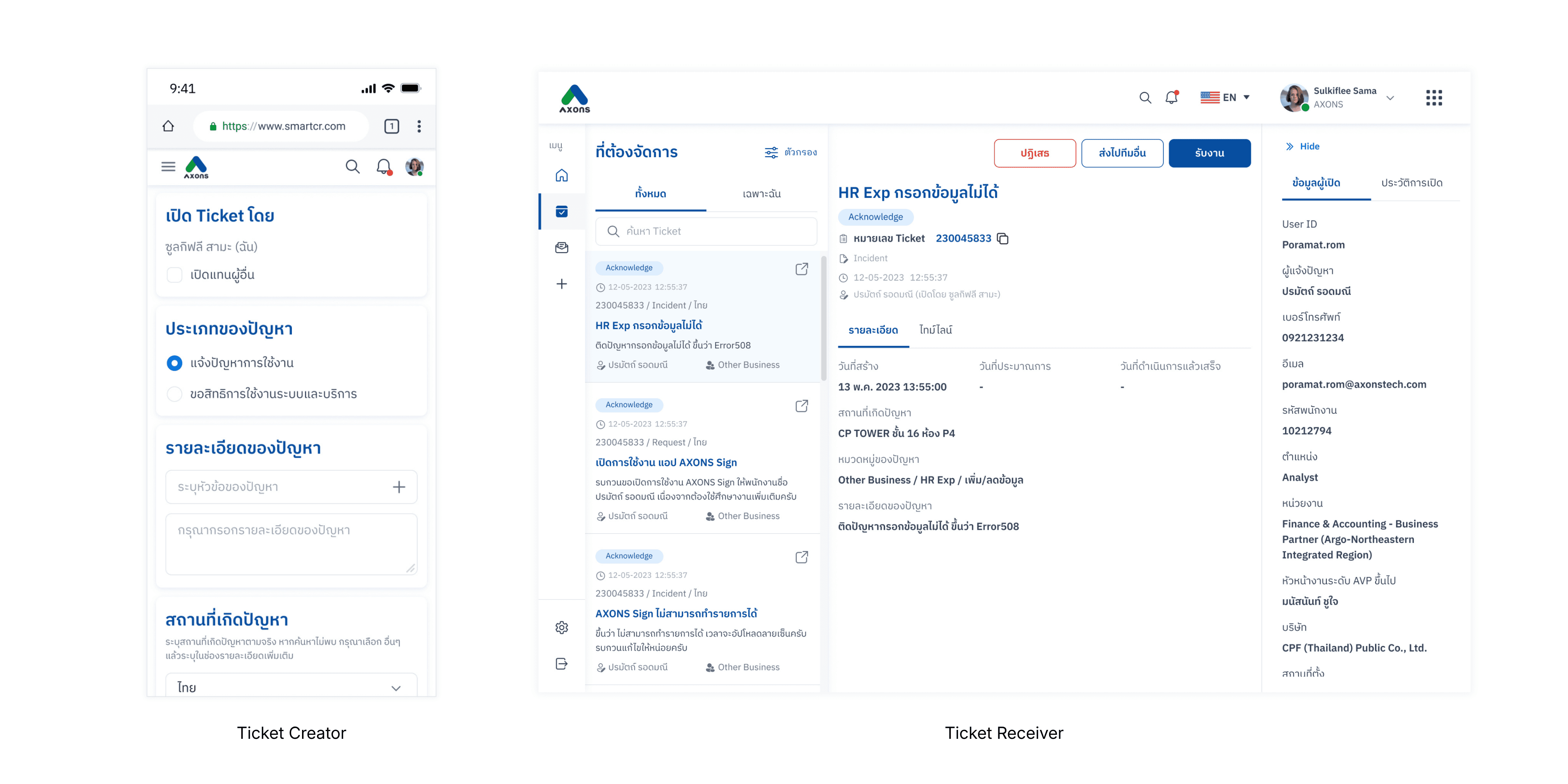
On the Receiver side, the challenge was different. Tickets were received by whichever business unit owned the system in question — each unit with its own responsible people — so the receiving experience was operationally complex, and much of it wasn't documented anywhere. Tickets could be accepted, rejected, transferred, split, or co-ordinated across teams, each with its own rules and SLA expectations. On top of that, a recurring pain: whenever IT staff needed clarification from the creator, the only option was a phone call. When that call went unanswered, the ticket stalled — work stopped, status stayed unknown, and neither side had a clear way to move forward.
The project brief was to redesign Smart CR — not a list of specific problems to solve. Before any design decision was made, the first step was to understand what was actually breaking, and for whom. The problems were different on each side.
On the Creator side, three things stood out.
1. Choosing a ticket type came first — and it was already confusing. Five types — Incident, Request, Complain, Database Request, SAP Service Request — most of which users couldn't distinguish, and choosing wrong sent the ticket into the wrong approval workflow entirely.
2. Then came the category structure — which pushed IT's org chart onto the user. Users had to select a Business Group from 20 to 30 team names with no idea which team managed their system, then navigate up to three further levels of internal naming.
3. And the form asked users to judge things they couldn't. The form asked every creator to rate the urgency, impact, and priority of their own problem. Predictably, almost everyone marked theirs critical — so the priority data carried no real signal, and the judgment sat with the one person least equipped to make it. Other fields weren't broken so much as unclear: their labels had drifted from their original intent, leaving users unsure what was even being asked.
On the Receiver side, the challenge was different. Tickets were received by whichever business unit owned the system in question — each unit with its own responsible people — so the receiving experience was operationally complex, and much of it wasn't documented anywhere. Tickets could be accepted, rejected, transferred, split, or co-ordinated across teams, each with its own rules and SLA expectations. On top of that, a recurring pain: whenever IT staff needed clarification from the creator, the only option was a phone call. When that call went unanswered, the ticket stalled — work stopped, status stayed unknown, and neither side had a clear way to move forward.
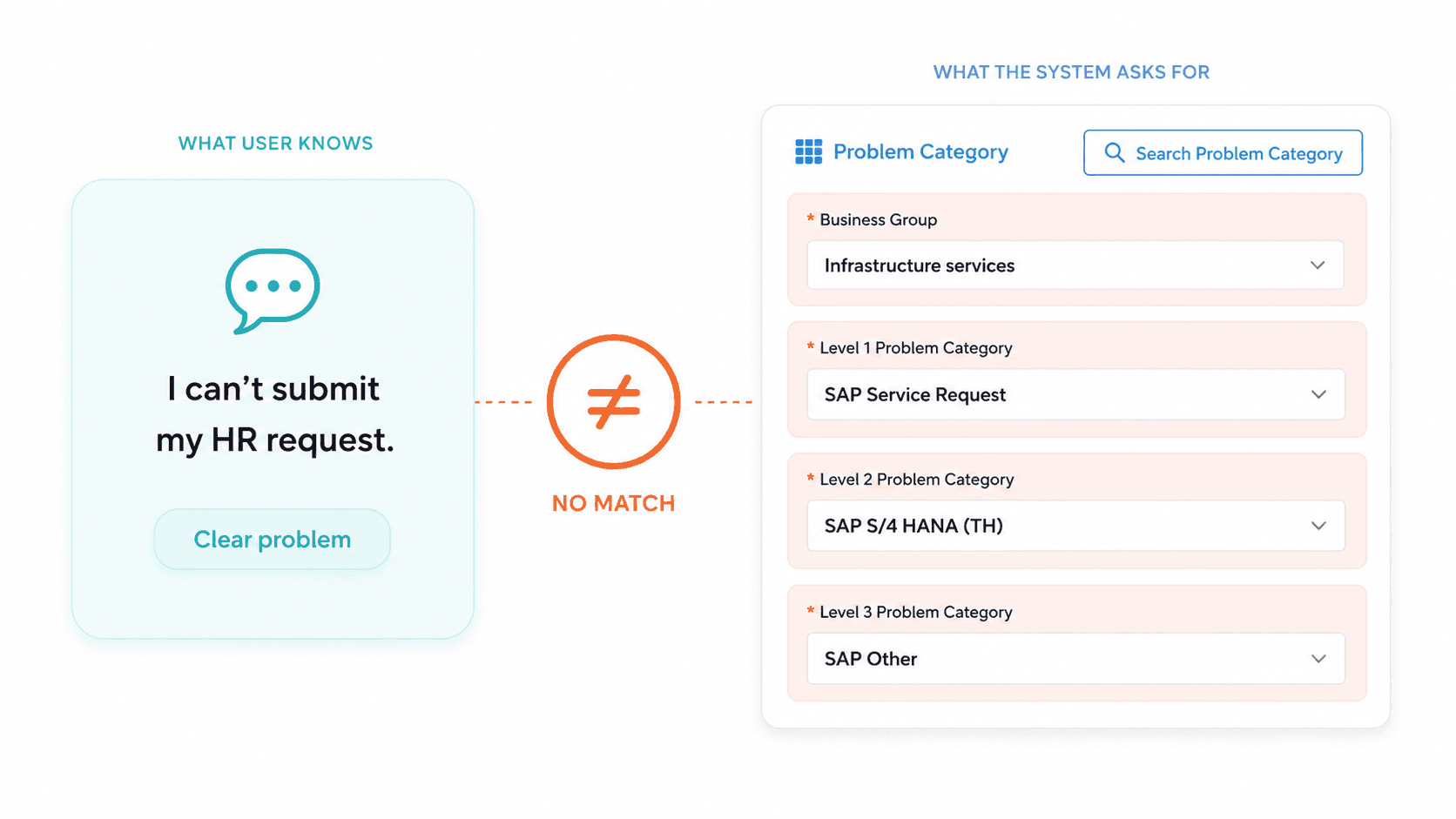
Users knew what they needed, but the system asked for internal categories they could not confidently choose.

The old form also pushed impact, urgency, priority, and SLA decisions onto users before they could submit a request.
Listening Across Nine Teams Before Touching the Design
Over two days in late March 2023, I planned and ran sessions with representatives from nine groups spanning everyone who touched the platform:
Group | Role in the system |
|---|---|
PMO, Sale, Other Business, Infrastructure, HR, Food | Six of the IT receiver teams — they resolved tickets and created their own |
Taokae | Graduate business development programme team, CPF Group |
Co-sponsor | Manager of the Taokae programme |
Users outside AXONS | CPF Group employees who submitted tickets with no IT background |
The non-IT employees were our biggest blind spot — representing the majority who struggled most with internal naming. The Taokae and Co-sponsor groups uncovered a hidden delegation pattern: users creating tickets on behalf of others, something the old system had completely ignored.
Creator interviews were structured around the user journey — walking through each step in the submission flow and asking where friction or uncertainty appeared. Category selection came up in every session, without being prompted.
Employees had started messaging IT staff directly to ask which category to choose — before even opening the form. That had become informal standard practice across teams.
The Receiver side took more untangling. The full set of cases a ticket could move through wasn't documented anywhere, so I worked with the product owner to decode them first — every route, every handoff, every exception. Only then could I go through each step and each case with the receiving teams, surfacing where they struggled and what they expected at each point.
All insights were synthesised together and prioritised with the product owner and development team. One idea needed validating before it could be designed: if the category step were replaced by a search, would people actually describe their problems in ways the system could match? I ran quick informal tests — giving people a scenario and seeing what they'd type — to check the concept was viable before committing to it.
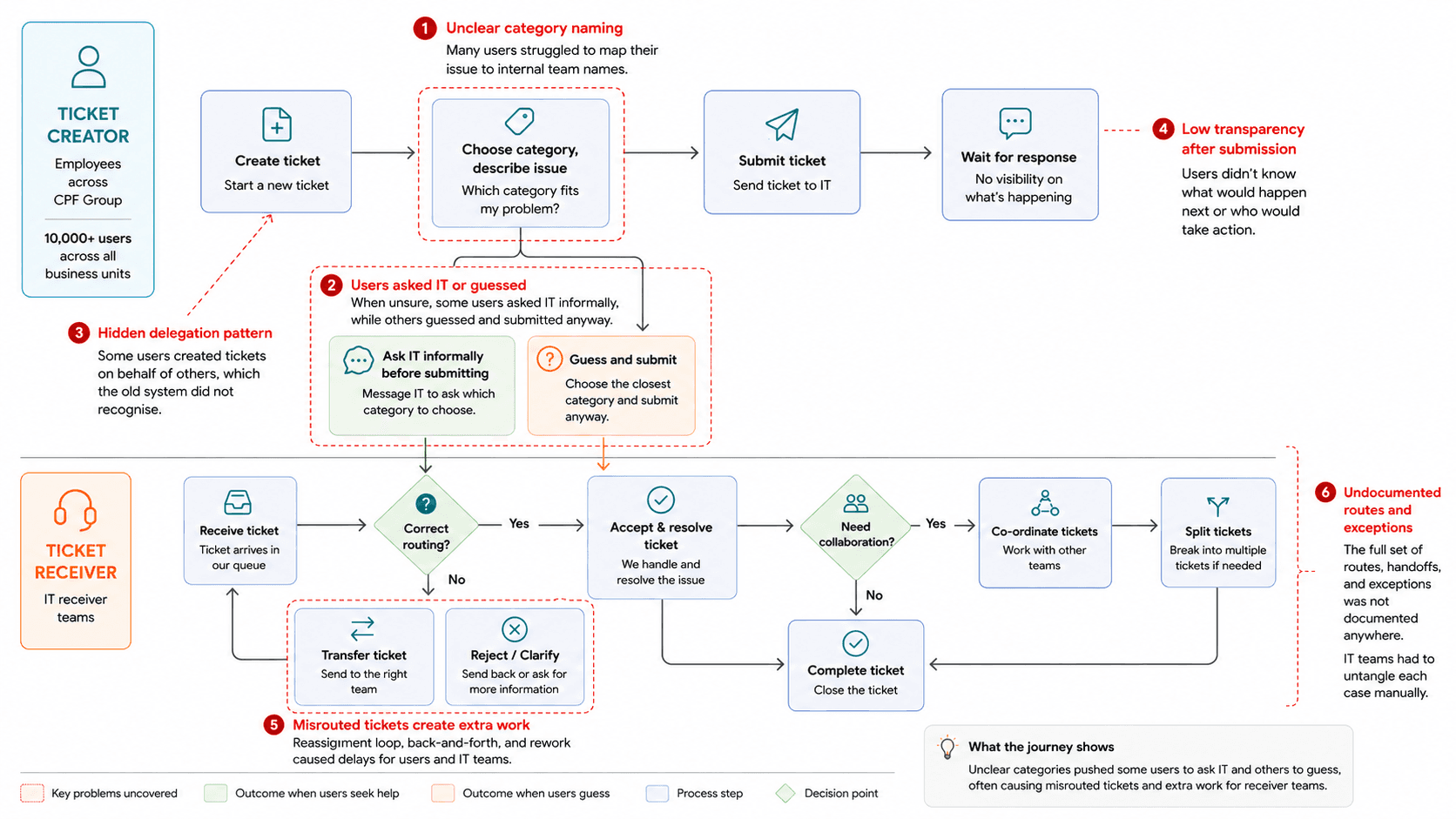
Mapping the full ticket journey revealed how unclear categories created guesswork for creators, misrouted tickets, and extra handoffs for receiver teams.
Making the System Do the Thinking
The redesign addressed what the research found — differently for each side.
On the Creator side:
Ticket type: simplified from five to two — Incident and Request — each mapped to its own approval workflow and given a short description. Users now identify their case instantly.
Category selection: removed from the user entirely. Users type a short description of their problem; the system surfaces matching suggestions — trained on more than 100,000 past tickets — and routes automatically. No Business Group to navigate, no sub-levels to guess.
It went one step further. When a problem had a known fix the user could apply themselves, the system surfaced that solution first — letting them try it before opening a ticket at all. Routing the right tickets to the right team was only half the goal; the other half was keeping repetitive, self-solvable issues out of the queue entirely.
A search-first approach only works if it handles the messy cases too. The design accounted for people who searched and found nothing, who didn't know the name of the system they were using, or who described the problem without naming the app at all. Anything the system couldn't confidently match fell into an "unknown" category — a holding space that a person reviewed and routed in the early phase, while the matching was still learning. The intelligence wasn't automatic on day one; it had to be trained, and the design made room for that.
Form fields: clarified, and one taken off the user. The priority self-assessment was removed from the creator entirely — rating urgency was never their job, and the data it produced was meaningless anyway. Remaining fields were rewritten so their purpose was clear to every user, regardless of background.
On the Receiver side:
The receiver workflow was redesigned from the ground up — built on the full route and case map from the research. Accepting, co-ordinating, transferring, splitting, and rejecting each became clearly defined flows. Priority assessment moved here too, where the expertise actually was: instead of guessing an SLA, the receiver answers two structured questions — urgency and impact — and the system computes the priority and SLA automatically. A chat feature was added so creators and receivers could communicate inside the ticket, keeping context in one place rather than scattered across phone calls.
An interactive prototype covering all flows — Creator and Receiver — was built and tested before handoff.
One reflection: the category suggestion architecture was already built on data. Today, the same 100,000+ ticket database would be strong training material for a more conversational experience. The foundation was already there.
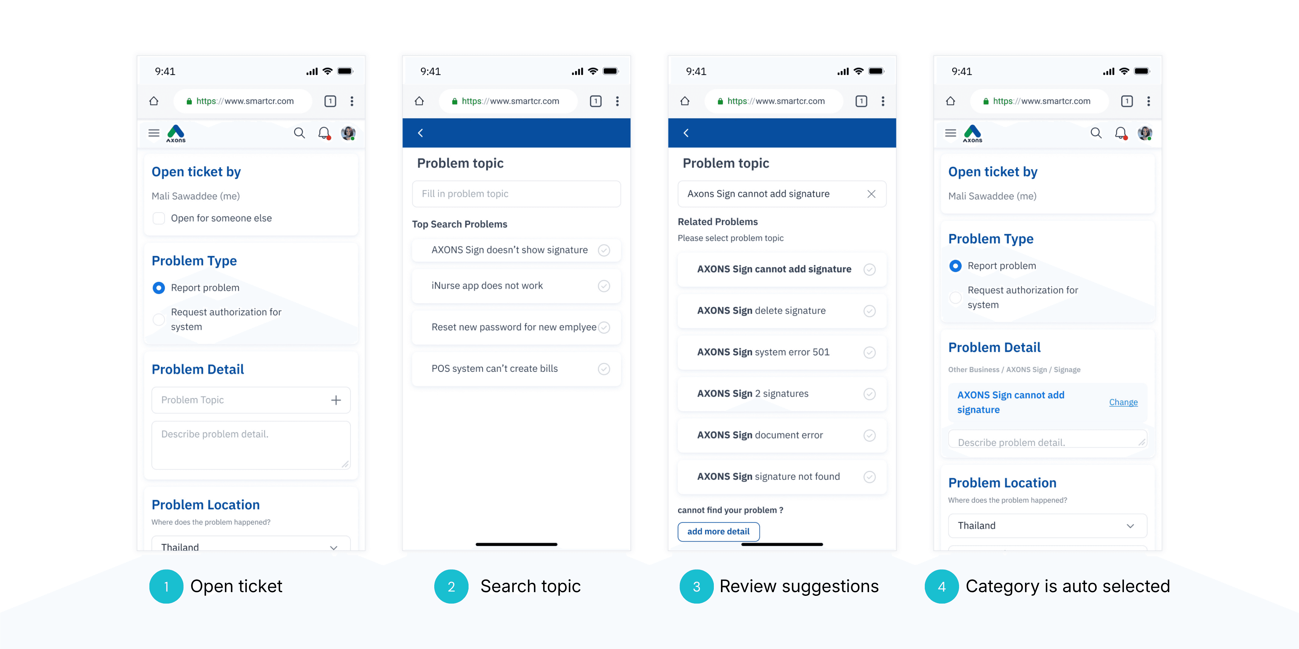

(Top) New open ticket flow: the system helps creators find the right case from a simple problem description. (Bottom) New accept ticket flow: receivers provide urgency and impact, and the system calculates priority automatically.
What the Scores Showed, and What I Still Think About
Two separate usability tests ran — one on each side of the platform.
The Creator test (15 participants) — SUS 81.19%, UI score 4.78 / 5, CES across three scenario dimensions: 4.07 – 4.35 / 5.
The Receiver test (7 IT staff) — SUS 87.24% (Good range), UI score 4.57 / 5, CES across seven tasks: 4.36 – 5.00 / 5.
Both sides: low effort. The Receiver score is particularly strong given the complexity of what was tested — the redesigned workflow simplified tasks that previously required multiple handoffs and no shared communication channel.


Although I transitioned before the full rollout, the project was successfully handed over to the development team — serving as the blueprint for the current production environment.
Enterprise UX friction is rarely caused by bad design alone. It is usually caused by a system built around internal logic, then asked to serve people who don't share it. Closing that gap — even partially — is where the real work is.