Lab Equipment Booking and Approval Tool
Lab Equipment Booking and Approval Tool
Redesigning a legacy lab-equipment booking platform so a multi-role supply flow stays clear at every handoff
Redesigning a legacy lab-equipment booking platform so a multi-role supply flow stays clear at every handoff
Service UX
•
Service Flow
TYPE:
Service Tool
ORG.:
AXONS, Thailand
YEAR:
2024
DURATION:
2 months
Project Snapshot
Contribution
Contribution
Sole designer, with a lead supervising. I took the project from research to build-ready design on my own, turning a complex, multi-role operation into one clear UI blueprint. (Title on the project: Senior UX/UI Designer.)
Sole designer, with a lead supervising. I took the project from research to build-ready design on my own, turning a complex, multi-role operation into one clear UI blueprint. (Title on the project: Senior UX/UI Designer.)
Context
Context
(IT Services & Consulting, CPF Group), 2023. A full redesign of a dated internal platform used to book lab equipment across the CPF group. Every user is internal to the group. The product is web-first and defaults to Thai.
(IT Services & Consulting, CPF Group), 2023. A full redesign of a dated internal platform used to book lab equipment across the CPF group. Every user is internal to the group. The product is web-first and defaults to Thai.
Methods
Methods
Stakeholder interviews, legacy-flow extraction, multi-role flow mapping, information architecture, UI design, export-template design, and design-system integration.
Stakeholder interviews, legacy-flow extraction, multi-role flow mapping, information architecture, UI design, export-template design, and design-system integration.
A booking tool that was really a supply line
SMART-B is how CPF group farms get the equipment they need to do their work. A vet or an animal-husbandry lead plans the month's sampling, works out what they will need, and books it from the lab.
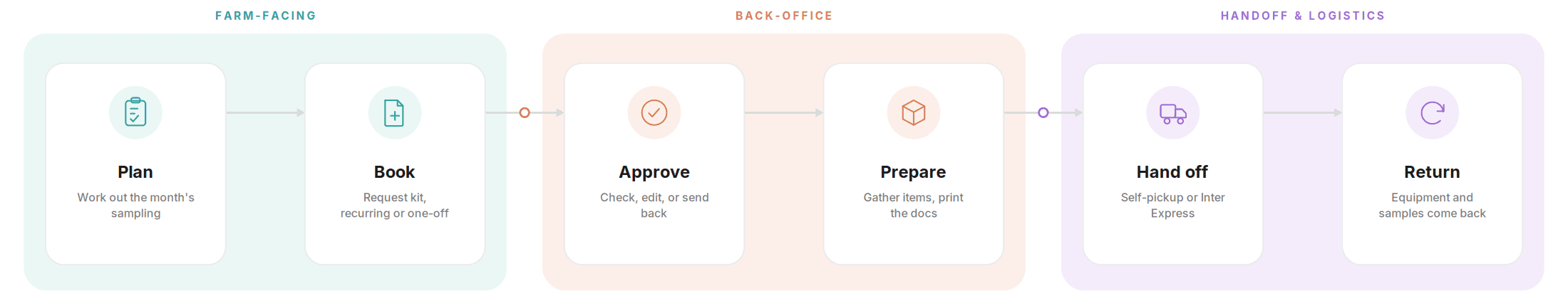
That is the surface. Underneath, one booking runs through several hands: a farm requests the equipment, a lab checks and approves it, then prepares the items and prints the paperwork, and the order goes out for pickup or through Inter Express, an external courier. Later, the equipment and the samples come back.
So the booking screen was never really a form. It was the one place where farm-facing requests met back-office operations and an outside courier. My job was to design that touchpoint so the whole flow stayed clear to everyone in it: request, approve, prepare, hand off, return. And because the work runs into printed documents and real deliveries, the design had to bridge the digital tool and the physical operation around it.
SMART-B is how CPF group farms get the equipment they need to do their work. A vet or an animal-husbandry lead plans the month's sampling, works out what they will need, and books it from the lab.
That is the surface. Underneath, one booking runs through several hands: a farm requests the equipment, a lab checks and approves it, then prepares the items and prints the paperwork, and the order goes out for pickup or through Inter Express, an external courier. Later, the equipment and the samples come back.
So the booking screen was never really a form. It was the one place where farm-facing requests met back-office operations and an outside courier. My job was to design that touchpoint so the whole flow stayed clear to everyone in it: request, approve, prepare, hand off, return. And because the work runs into printed documents and real deliveries, the design had to bridge the digital tool and the physical operation around it.
End to end booking flow across farm facing, back office, and logistics steps.
An old system people had to work around
The tool was dated — but the real problem wasn't how it looked. It was how easily a request went wrong, and how hard it was to put right.
On the farm side, the booking flow didn't capture how the lab actually worked:
Recurring orders — some kit is booked on a repeating schedule
Items with their own sub-options
Booking on someone else's behalf — when a farm user couldn't enter a request, they'd phone the lab to do it for them
…so requests often arrived incomplete or incorrect.
On the lab side, a wrong request couldn't simply be fixed:
It was cancelled, or rebuilt by hand in Excel — pivot tables, cover sheets made one at a time
Status was never visible, so edits slipped past and the wrong things got approved
The design question wasn't cosmetic: how do you help a request arrive complete and correct, and give the lab room to adjust, approve, or send it back — without falling back to spreadsheets and paper?


The old setup: a weekly grid, with the real list on paper.
Mapping the work, not just the screens
I started by learning a domain I knew nothing about. I sat with the work, interviewed the people on both sides, and took apart how the old program behaved.
Two sides shaped every decision: the farm staff raising requests — some on the web, some from a phone — and the lab staff receiving them. The web-versus-phone split mattered, because the old mobile app couldn't show status or let anyone edit.
Then I mapped the multi-role operational flows the old system had hidden (approve, export, pickup and return, and history) and drew a sitemap for both roles. This is where the service thinking did the real work. I focused on the moments a request passes from one person to the next: farm to approval, approval to preparation, preparation to courier, and courier back to farm. Those handoffs were exactly where the old system lost people.


Sitemaps I rebuilt for both sides, farm and lab/admin

Lab-user flow diagram
Designing for clarity at every handoff
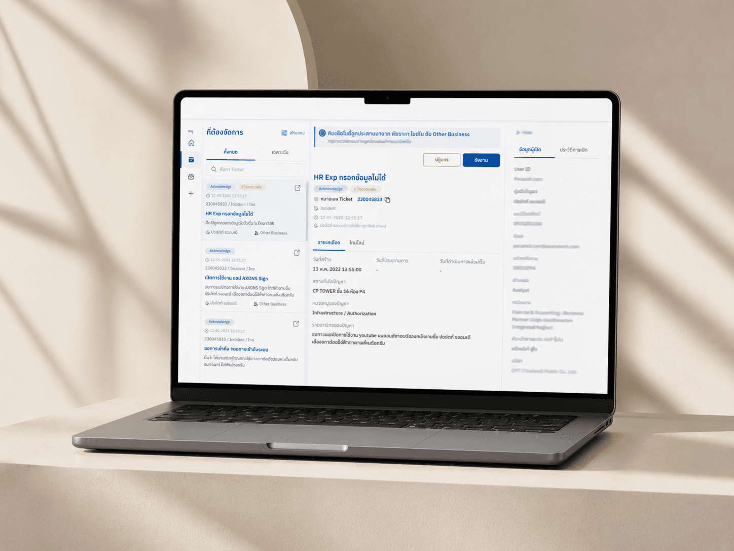
With the flows mapped, I designed every screen to answer two questions: where is this request now, and what happens next. Status moved out of the table and onto the surface, across the whole life of a booking, from pending approval to approved, out for delivery, pending return, and returned.
I made booking simple by default but flexible underneath. The old equipment search was a cramped popup of tiny rows. The new flow is a guided list with clear options, quantities, and a confirmation step, plus an empty state that tells first-time users what to do.
The harder cases needed care too. I designed recurring bookings for items needed on a repeating schedule, and equipment that carries its own sub-options. I also designed for a real field habit: when a farm cannot book for itself, a lab books on its behalf, while keeping it clear who booked and for whom.
The receiving side is where the digital tool had to meet the physical work. The approval view lets staff check, edit, send back with a reason, or reject. And instead of rebuilding paperwork by hand, the lab documents now generate straight from the booking:
The preparation note each lab works from
The equipment cover sheet for the items
The parcel cover sheet for Inter Express
The Inter Express handover form
The ISO form
The receipt sign-off for self-pickup
Because some of this depended on technical changes, I sequenced the work into phases and kept features like equipment tracking for later releases. Throughout, I applied the AXONS Design System and stretched it only where the flow needed it.


Designed, validated, and handed on
By the end, the design was build-ready. I built out the main cases in high fidelity and reviewed the redesign with users, who found it far simpler, faster, and clearer than the old system.
I handed the build team a complete, validated blueprint: the user flows, the information architecture, the design-system-aligned UI, and a set of reusable export templates they could develop straight from.
I don't just design screens. I design the service behind them, taking an operation that sprawls across people, paperwork, and handoffs, and turning it into something anyone in the chain can run with confidence. The screen is only where that clarity shows up. Get the people and the handoffs right, and the screens follow.