SSC Payment E-Forms

SSC Payment E-Forms

The full journey of a payment request inside CPF's shared service center (SSC): three roles, a multi-level approval chain, and the edge cases that usually break it

The full journey of a payment request inside CPF's shared service center (SSC): three roles, a multi-level approval chain, and the edge cases that usually break it

Enterprise Platform UX

Complex Workflow Design

TYPE:

Exterprise Platform

ORG.:

AXONS, Thailand

YEAR:

2024

DURATION:

2 months

Project Snapshot

Contribution

Contribution

Senior UX/UI Designer, and the sole designer on the project. I contributed from talking to users and mapping the journey, to the information architecture, the requester, approver, and P2P interfaces, the interactive prototype, and the usability testing I planned and ran myself. I worked closely with a Product Owner throughout.

Senior UX/UI Designer, and the sole designer on the project. I contributed from talking to users and mapping the journey, to the information architecture, the requester, approver, and P2P interfaces, the interactive prototype, and the usability testing I planned and ran myself. I worked closely with a Product Owner throughout.

Context

Context

An internal platform that digitizes payment change and cheque requests for CPF's shared service center, the central team that processes payments on behalf of many companies across the group, in Thailand and abroad. It runs across three roles: the Requester who raises a request, the Approver who signs off, and the P2P (Procure to Pay) team who carries it out, split into AP and PP. Behind it sits an admin side for managing users, roles, and permissions.

An internal platform that digitizes payment change and cheque requests for CPF's shared service center, the central team that processes payments on behalf of many companies across the group, in Thailand and abroad. It runs across three roles: the Requester who raises a request, the Approver who signs off, and the P2P (Procure to Pay) team who carries it out, split into AP and PP. Behind it sits an admin side for managing users, roles, and permissions.

Methods

Methods

Research: user interviews, as-is and to-be journey mapping Structure: information architecture, sitemap, role based user flows Design: form digitization, interactive prototype built on the AXONS design system Validation: self run usability testing with think aloud and per task effort scoring, affinity mapping, and impact by ubiquity prioritization

Research: user interviews, as-is and to-be journey mapping Structure: information architecture, sitemap, role based user flows Design: form digitization, interactive prototype built on the AXONS design system Validation: self run usability testing with think aloud and per task effort scoring, affinity mapping, and impact by ubiquity prioritization

Turning paper into a system, not just forms online

Asking to change a company payment used to be a slow, paper driven ritual. You printed a form, signed it by hand, scanned it, and emailed it on. An approver signed it. The P2P team carried out the change in the back office. Every print, scan, and forward was another place for the request to slip through the cracks.

My job was not to design a few screens. It was to design the whole path a single request travels, from the person who raises it, to the person who approves it, to the team who acts on it.

The platform had to handle requests for many companies across the group, and above all stay calm when things went sideways. A request that sails through is easy. A request that gets sent back, rejected, or cancelled is where people get lost, and that is where most of the design work went.

Transforming a fragmented paper process into one clear, trackable digital flow.

The real challenge was hidden in the journey

I started by sitting with the people who actually live in this process, from a requester with ten years on the job to a colleague who had just joined. The same problems came up on both ends. Printing and scanning ate enormous amounts of time. The back office often had to chase a personal chat message just to confirm a document had arrived. And because cheque requests were handled in manual Excel files, with company names changed by hand, people had sent requests under the wrong company before.

So the challenge was never really about a form. It was that three roles each wanted something different, every form type carried its own rules, and the messy states of work, like a request being sent back, needed a system that handled them with order instead of leaving them to chance.

Transforming a fragmented paper process into one clear, trackable digital flow.

Designing the path, not just the pages

Before drawing a single screen, I shaped the structure. The platform settled into four clear areas: a home to start a request, a full list of every request with status filters, a history with a tracking timeline, and a dashboard for reporting. Then I mapped each role on its own terms and lined up the handoffs between them, which is what kept the experience consistent across the journey rather than only inside one screen.

A few choices came straight from how the organization really works. I gave every request one shared set of states, so anyone in any role could tell at a glance where it stood. In a process that used to live in scattered emails, that shared status language was what let three teams talk about the same request without confusion.

The approval level itself was a business rule, not something I designed. Each request type already had a required level of sign off, printed right on the original paper forms. What I designed was the awkward case around it. When the right approver is on leave, a request used to simply sit and wait. So I built a clear way to skip to the next person up the chain, with a reason attached, so a single absence could not freeze a payment.

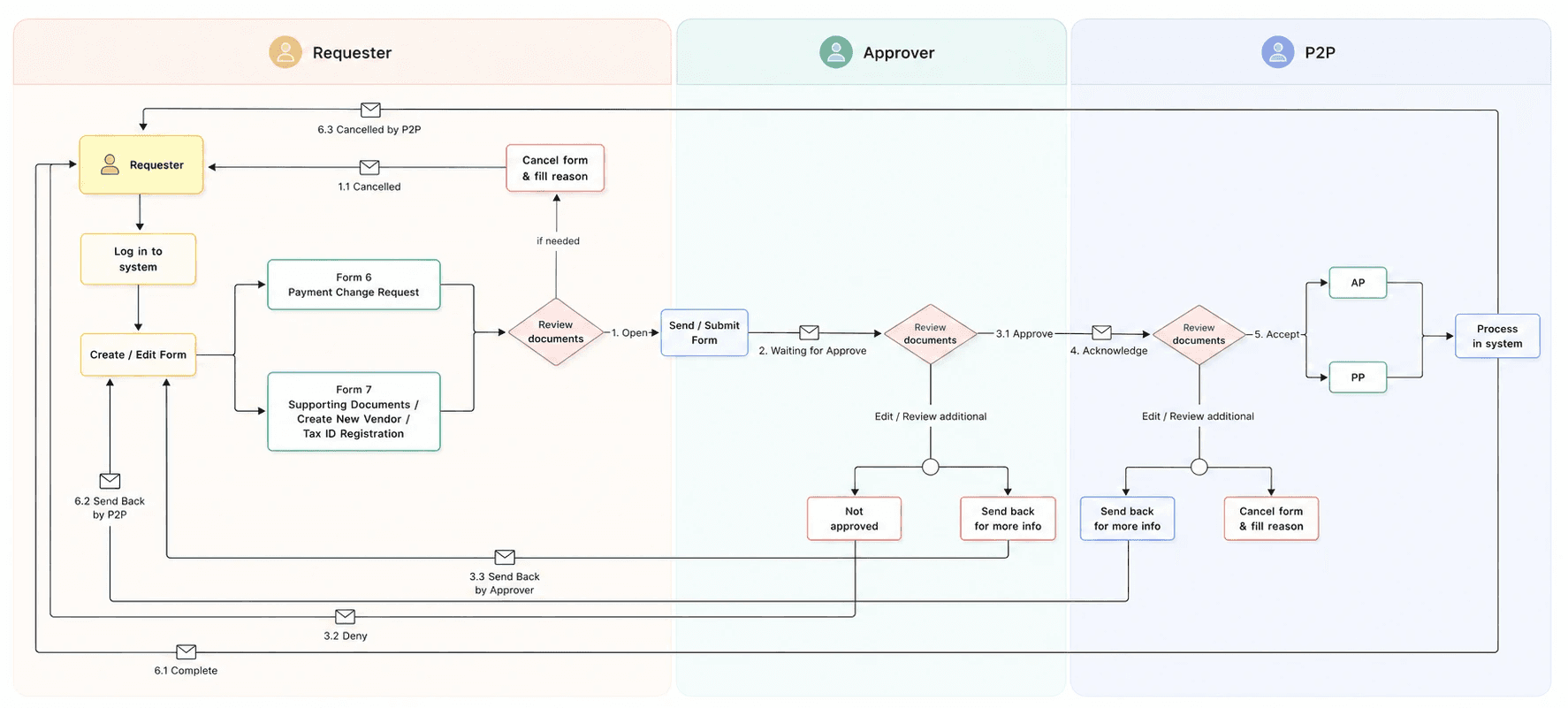
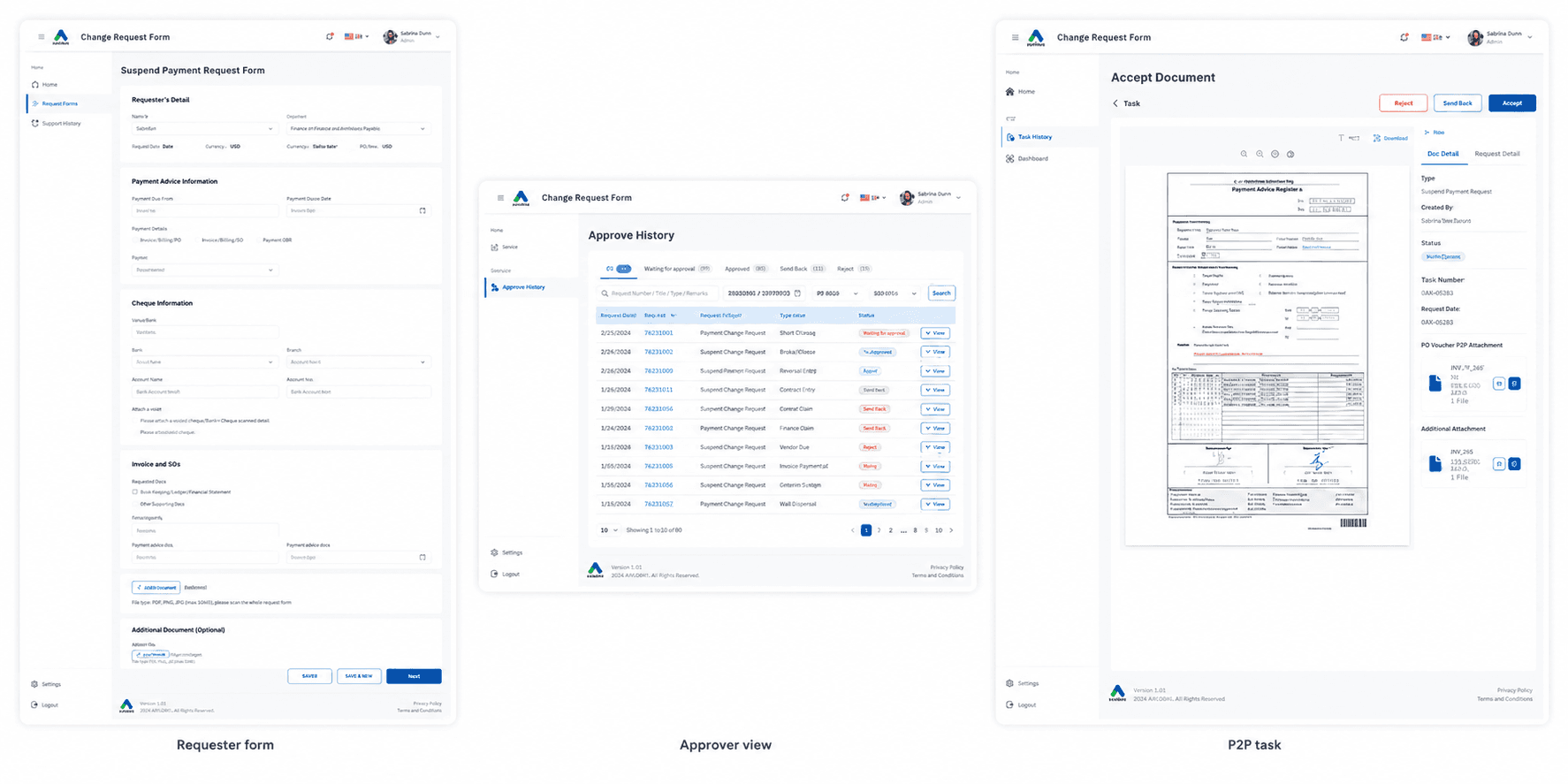
End to end payment change request flow across Requester, Approver, and P2P roles.

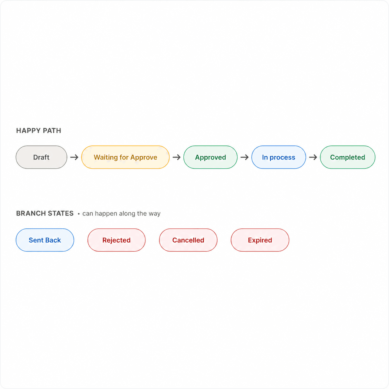
One shared set of request states helped every team understand exactly where a request stood.

Deciding who can do what

Three roles meant three very different levels of access. A requester should only raise and track their own requests, an approver should only see what is waiting on them, and the P2P team should only act on what has already been approved. So the platform needed proper role based permissions, managed from an admin console where each person is registered with their company, department, and role, then given exactly the access their job requires.

In a process where the wrong person acting on a request can cause a real financial mistake, deciding who can do what is part of the experience, not just a backend setting. That access layer, with the reporting dashboard on top, is what made this a small system in its own right rather than a single form.

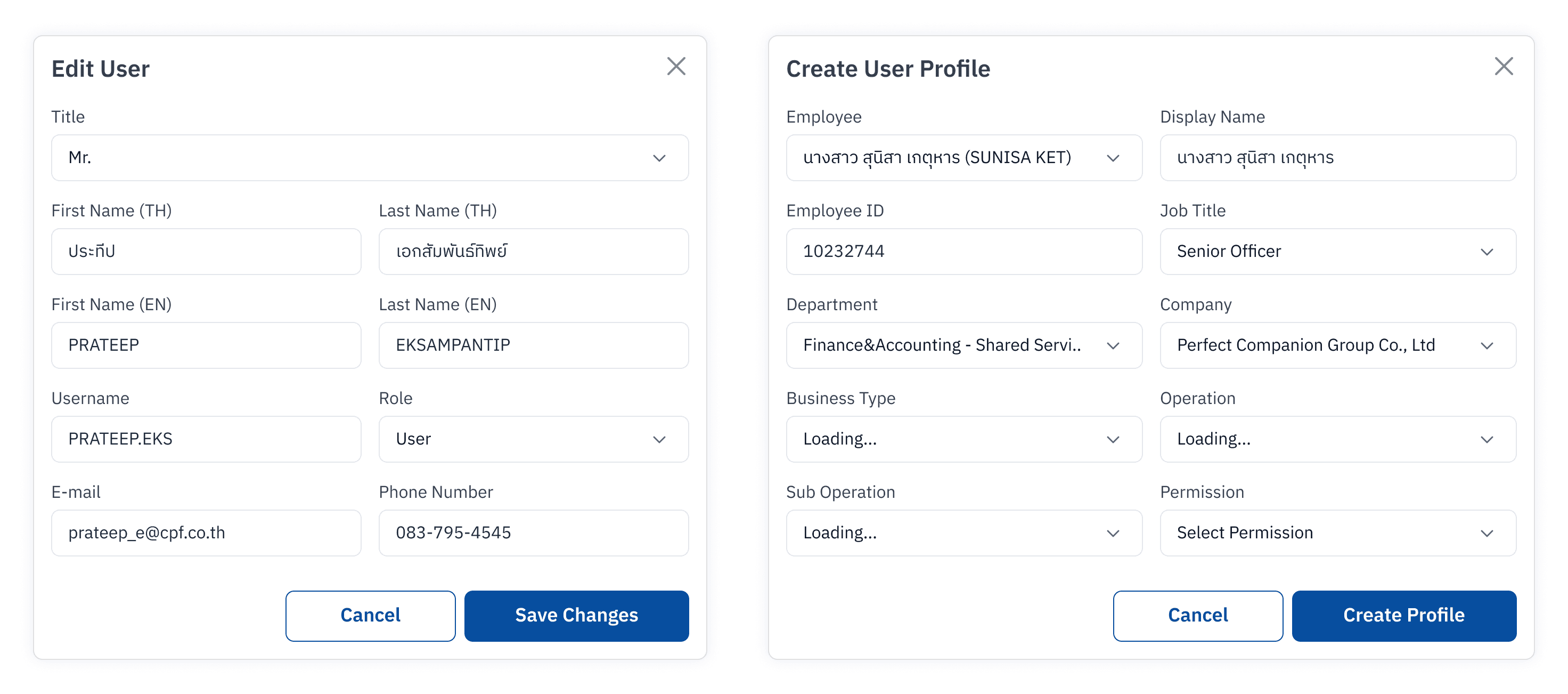
A centralized interface for managing user profiles and system roles.

Turning paper forms into forms people can actually fill

Each form became a guided experience instead of a blank page. I broke long forms into sections, showed only the fields that matched the request type, and added validation so people could not submit something incomplete or wrong.

The sharpest example came straight from research. People who handle several companies had been overwriting company names in Excel and sometimes getting them wrong. So instead of pre filling the company, I made it a deliberate choice in its own section, which quietly removed a whole class of error. Around that, I designed the everyday rescue features: saving a draft so nothing is ever lost, bulk uploading by Excel for requests with a hundred line items, and a status timeline that records who did what and when. The messy states got real screens too, a sent back request with its reason, a cancelled one, an expired one, the emergency skip path, and the case where the P2P team passes a request to a colleague to finish.

All of it was built by composing and adapting components from the AXONS design system, so dozens of forms and screens still felt like one product.

Examples of features

Tested, tuned, and handed off

I planned and ran the usability test myself, from the script to the analysis. Five people took part, one to one, across the requester and P2P roles, with tenures from new to over twenty years, each thinking aloud through tasks I wrote for their role.

What came back was strong. The platform scored 84.29 on the System Usability Scale, which lands in its top band, with a perfect 100 on the interface score and task effort ratings between 4.4 and 5 out of 5 across the six tasks. One requester put it simply: the information felt complete, with little to key in.

Most of what surfaced was small. A saved draft that was a little hard to find, an approver flow with a step too many, an unclear line between Send Back and Reject. None of it was a rethink. The fixes were light, and several were less about the interface than about matching how people actually work. After those tweaks the designs were approved, handed to a teammate to take into development, and the platform later went live. I moved on before the build, so I cannot speak to post launch numbers.

What stayed with me is that the value was never in a single screen. It was in seeing a request as something that travels between people, and giving the handoffs and the broken moments as much care as the smooth ones. Mapping roles, states, and edge cases before drawing is likely why testing surfaced polish rather than problems. It also showed me how much enterprise design is translation work, taking a paper form full of accounting logic and shaping it into something a person can move through without fear of getting it wrong.

Every good experience
starts with a conversation.

Whether it’s a product, service, workflow, or story,

I’d love to explore how we can shape it together.

MIKI ©2026, All rights reserved

Every good experience
starts with a conversation.

Whether it’s a product, service, workflow, or story,

I’d love to explore how we can shape it together.

MIKI ©2026, All rights reserved

Every good experience
starts with a conversation.

Whether it’s a product, service, workflow, or story,

I’d love to explore how we can shape it together.

MIKI ©2026, All rights reserved