
Designing a digital purchase experience that has to coordinate delivery, installation, and after-sales
Designing a digital purchase experience that has to coordinate delivery, installation, and after-sales
Service UX
•
E-commerce
TYPE:
E-commerce
ORG.:
Lotus's, Thailand
YEAR:
2022
DURATION:
2 months
Project Snapshot
Contribution
Contribution
Designed the digital touchpoints of an end-to-end service. Customer journey mapping, constraint and operational mapping, site map, user flow, and high-fidelity UI, all grounded in the real constraints of delivery, installation, payment, and support.
Designed the digital touchpoints of an end-to-end service. Customer journey mapping, constraint and operational mapping, site map, user flow, and high-fidelity UI, all grounded in the real constraints of delivery, installation, payment, and support.
Context
Context
Lotus's (formerly Tesco Lotus) is a leading omnichannel retailer in Southeast Asia with over 2,000 stores. Its app began as a grocery and FMCG platform. The business wanted to add Hardline Electronics (HLE): large appliances like TVs, air conditioners, refrigerators, and washing machines, each carrying a full service tail of delivery, installation, installment, and after-sales. Roughly a two-month project in 2022.
Lotus's (formerly Tesco Lotus) is a leading omnichannel retailer in Southeast Asia with over 2,000 stores. Its app began as a grocery and FMCG platform. The business wanted to add Hardline Electronics (HLE): large appliances like TVs, air conditioners, refrigerators, and washing machines, each carrying a full service tail of delivery, installation, installment, and after-sales. Roughly a two-month project in 2022.
Methods
Methods
Customer journey mapping, constraint mapping, competitive benchmarking, desk research, site map, user flow, high-fidelity UI design.
Customer journey mapping, constraint mapping, competitive benchmarking, desk research, site map, user flow, high-fidelity UI design.
A Product Becomes a Service
Lotus's app was built for groceries. Quick decisions, low stakes, easy replacements. Buy a bag of rice, and the "service" is basically just handing it over.
A refrigerator is different. Selling it is not a single transaction. It's a service that unfolds over weeks: a scheduled delivery, a separate installation visit, payment that may run over months, and a support relationship if something goes wrong.
So when the business asked me to design the digital experience for Lotus's Hardline Electronics (HLE) category, the real brief was bigger than screens. It was: design the digital layer of a service that has to coordinate logistics, installation crews, a payment provider, and customer support, all inside an app that was never built to carry a service this heavy.
Lotus's app was built for groceries. Quick decisions, low stakes, easy replacements. Buy a bag of rice, and the "service" is basically just handing it over.
A refrigerator is different. Selling it is not a single transaction. It's a service that unfolds over weeks: a scheduled delivery, a separate installation visit, payment that may run over months, and a support relationship if something goes wrong.
So when the business asked me to design the digital experience for Lotus's Hardline Electronics (HLE) category, the real brief was bigger than screens. It was: design the digital layer of a service that has to coordinate logistics, installation crews, a payment provider, and customer support, all inside an app that was never built to carry a service this heavy.

Why a Grocery App Can't Just "Add" Appliances
Groceries are short cycle, low risk, instant replacement. HLE is high value, long cycle, with delivery, installation, and after-sales all attached.
The difference isn't the product. It's the service wrapped around it. A customer buying an air conditioner is really buying a promise: that it will arrive, be installed correctly, and be supported afterward.
That reframed the whole problem. I wasn't just designing a buying flow. I was designing the visible, frontstage layer of a service, while the backstage (stock hubs, regional installation coverage, payment rules) had real limits the customer would eventually run into.
The challenge became: how do you make a complex, multi-party service feel simple and trustworthy from inside a grocery app?
Groceries are short cycle, low risk, instant replacement. HLE is high value, long cycle, with delivery, installation, and after-sales all attached.
The difference isn't the product. It's the service wrapped around it. A customer buying an air conditioner is really buying a promise: that it will arrive, be installed correctly, and be supported afterward.
That reframed the whole problem. I wasn't just designing a buying flow. I was designing the visible, frontstage layer of a service, while the backstage (stock hubs, regional installation coverage, payment rules) had real limits the customer would eventually run into.
The challenge became: how do you make a complex, multi-party service feel simple and trustworthy from inside a grocery app?


Three design tensions to resolve
Mapping the Whole Service, Not Just the Screens
To navigate the ambiguity of the initial brief, I initiated a competitive benchmark of how others sell large electronics online: Power Buy, HomePro, ไทวัสดุ, NocNoc, BaNANA, and Taobao. The recurring painpoint was clear: the experience falls apart exactly when installation enters the picture, and these purchases demand detailed, well-organized information.
Then I mapped the full customer journey across before, during, and after. The map made the core service-design insight obvious: the purchase click is a tiny part of the service. The journey starts at discovery and continues long after the delivery truck leaves, into installation, support, and claims.
The journey also exposed a branch driven by how the service is paid for. Paying in full, the customer schedules delivery and installation together. Using installment, they schedule delivery only, receive the parcel, then schedule installation afterward. The payment model literally reshapes the service choreography, so the design had to handle both.
To make sure the frontstage I was designing could actually be delivered, I mapped the user flow against the real operational constraints of the business. I analyzed how each touchpoint interacted with backend realities: hub stock limits, regional installation crews, and the external payment gateway. This constraint mapping is what kept the design honest. It's easy to draw a smooth checkout; it's harder to draw one that survives contact with stock that's tied to a hub, coverage that varies by region, and a gateway that can fail.
I worked closely with the Business Analyst, who led the brief and was my main point of contact, and the Product Owner, who helped work through specific cases. Developers came in at handoff.
To navigate the ambiguity of the initial brief, I initiated a competitive benchmark of how others sell large electronics online: Power Buy, HomePro, ไทวัสดุ, NocNoc, BaNANA, and Taobao. The recurring painpoint was clear: the experience falls apart exactly when installation enters the picture, and these purchases demand detailed, well-organized information.
Then I mapped the full customer journey across before, during, and after. The map made the core service-design insight obvious: the purchase click is a tiny part of the service. The journey starts at discovery and continues long after the delivery truck leaves, into installation, support, and claims.
The journey also exposed a branch driven by how the service is paid for. Paying in full, the customer schedules delivery and installation together. Using installment, they schedule delivery only, receive the parcel, then schedule installation afterward. The payment model literally reshapes the service choreography, so the design had to handle both.
To make sure the frontstage I was designing could actually be delivered, I mapped the user flow against the real operational constraints of the business. I analyzed how each touchpoint interacted with backend realities: hub stock limits, regional installation crews, and the external payment gateway. This constraint mapping is what kept the design honest. It's easy to draw a smooth checkout; it's harder to draw one that survives contact with stock that's tied to a hub, coverage that varies by region, and a gateway that can fail.
I worked closely with the Business Analyst, who led the brief and was my main point of contact, and the Product Owner, who helped work through specific cases. Developers came in at handoff.

Customer Journey Mapping

One customer journey, shaped by payment and operational realities.
Four Service Principles Behind Every Screen
The journey and operational mapping led to four principles. Each is really a service decision expressed through the interface.
1. Guide the decision, don't leave people to figure it out. A structured flow (address, then availability, then checkout, then scheduling) means the customer always knows where they are in the service, and constraints appear at the right moment instead of as surprises.
2. Make the service visible, not just the product. Delivery, installation, and installment are part of what people are buying, so the design surfaces them early with badges and options, right on the product and cart screens. The service is sold alongside the product, not discovered after.
3. Show operational constraints before they become surprises. Bangkok and upcountry follow different service flows, slots can change, installation can cost extra, and HLE items can't mix with groceries in one order. The design exposes these at the decision point, so the frontstage never promises what the backstage can't keep.
4. Reduce anxiety with clear post-purchase support. The service doesn't end at payment, so neither does the design: order tracking, a claim flow with image upload for defects, a Help Centre form, and a searchable FAQ.
Suggested visuals: Service principle UI screens, one or two per principle, identical phone frames. For Principle 3, the BKK vs upcountry cart screens side by side.
The journey and operational mapping led to four principles. Each is really a service decision expressed through the interface.
1. Guide the decision, don't leave people to figure it out. A structured flow (address, then availability, then checkout, then scheduling) means the customer always knows where they are in the service, and constraints appear at the right moment instead of as surprises.
2. Make the service visible, not just the product. Delivery, installation, and installment are part of what people are buying, so the design surfaces them early with badges and options, right on the product and cart screens. The service is sold alongside the product, not discovered after.
3. Show operational constraints before they become surprises. Bangkok and upcountry follow different service flows, slots can change, installation can cost extra, and HLE items can't mix with groceries in one order. The design exposes these at the decision point, so the frontstage never promises what the backstage can't keep.
4. Reduce anxiety with clear post-purchase support. The service doesn't end at payment, so neither does the design: order tracking, a claim flow with image upload for defects, a Help Centre form, and a searchable FAQ.
Suggested visuals: Service principle UI screens, one or two per principle, identical phone frames. For Principle 3, the BKK vs upcountry cart screens side by side.


From Principles to Interface Decisions
This is where the service logic became concrete UI decisions. Rather than repeat the thinking, here is what it actually produced.
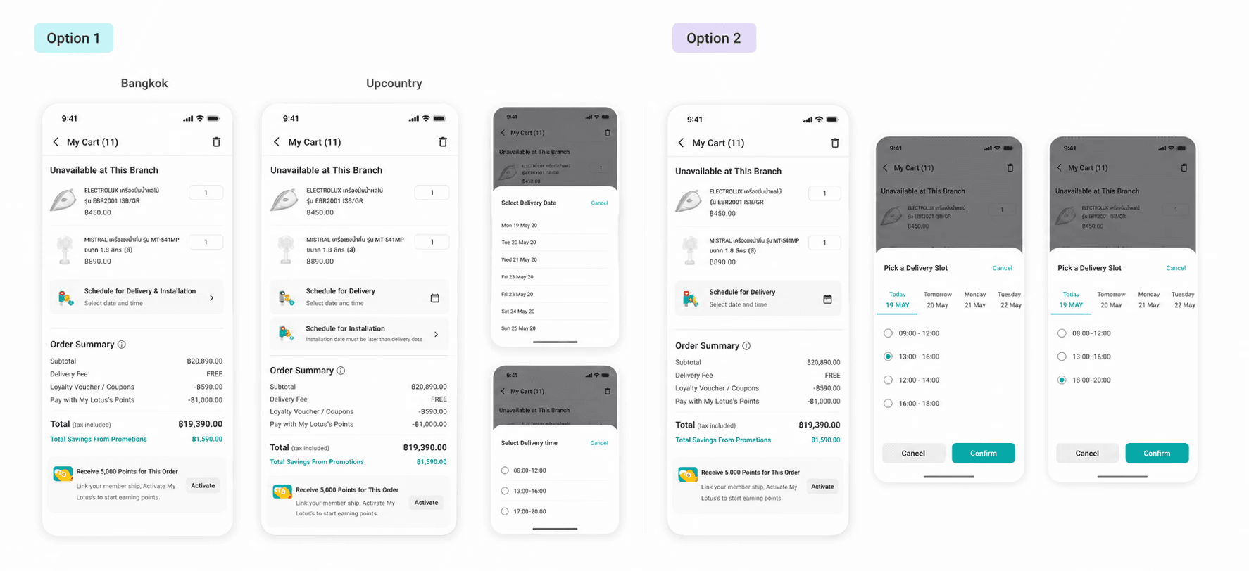
Regional scheduling logic. This was the clearest case. In Bangkok, delivery and installation could be planned as one combined visit. Upcountry, the product had to be delivered first and installation scheduled separately, because the teams operate differently by region. I translated that operational difference into two cart experiences, so customers saw the right service flow before placing an order rather than after.
Exploring alternatives. For heavier moments like installment, scheduling, payment, and the Help Centre, I explored multiple interface directions before choosing the version that best balanced simplicity with what the business could actually support. This is the proof that these were decisions, not just a single decorated screen.
Limit and recovery states. I also covered the states where the service hits a wall: payment gateway errors from the external provider, installment issues, cancellation limits, timeouts, and retry messages. These weren't the main strategy of the project, but they mattered, because each one traces back to a real service dependency, not a generic empty state.
This is where the service logic became concrete UI decisions. Rather than repeat the thinking, here is what it actually produced.
Regional scheduling logic. This was the clearest case. In Bangkok, delivery and installation could be planned as one combined visit. Upcountry, the product had to be delivered first and installation scheduled separately, because the teams operate differently by region. I translated that operational difference into two cart experiences, so customers saw the right service flow before placing an order rather than after.
Exploring alternatives. For heavier moments like installment, scheduling, payment, and the Help Centre, I explored multiple interface directions before choosing the version that best balanced simplicity with what the business could actually support. This is the proof that these were decisions, not just a single decorated screen.
Limit and recovery states. I also covered the states where the service hits a wall: payment gateway errors from the external provider, installment issues, cancellation limits, timeouts, and retry messages. These weren't the main strategy of the project, but they mattered, because each one traces back to a real service dependency, not a generic empty state.
Outcome and Reflection
The design covered the full service journey: discovery, checkout, delivery and installation scheduling, order tracking, and post-purchase support. The feature is now live on the Lotus's app.
Two honest notes. The separate landing page I designed wasn't used; customers enter HLE directly from the main shopping flow. And while much of the flow reused familiar grocery patterns, the service-specific parts (installation scheduling, claims, regional delivery logic) were new.
What this reinforced for me is that good service design lives in the structure, not the surface. Where does the customer enter the service? When do they learn about a constraint? Who, backstage, has to act for the frontstage to keep its promise? Answering those meant designing across the whole service, not just the screens.
The line I keep coming back to: when the stakes are high, guidance matters more than freedom, and a service that communicates its limits clearly is more trustworthy than one that hides them. Designing past the purchase moment is what turns a transaction into a service people can rely on.

